Overview of Plotly
# Essential imports for constructing data and plotting
import numpy as np
import pandas as pd
import matplotlib.pyplot as plt
import plotly.offline as py
import plotly.graph_objs as go
import plotly.figure_factory as ff
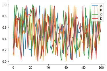
Plot with Matplotlib
# Create fake dataset to plot
df = pd.DataFrame(np.random.rand(100, 4), columns=['A', 'B', 'C', 'D'])
df.plot()
plt.legend(loc='upper right')
plt.show()
Plot with Plotly
# Create a fake dataset to show in plot
df = pd.DataFrame(np.random.rand(100, 4), columns=['A', 'B', 'C', 'D'])
data = ([
    {'x': df.index, 'y': df[col], 'name': col} for col in df.columns
])

# Create figure
fig = go.Figure(data=data)
# Show figure
py.iplot(fig)
Scatter Plot
np.random.seed(42)
random_x = np.random.randint(1, 101, 100)
random_y = np.random.randint(1, 101, 100)


data = [go.Scatter(
    x = random_x,
    y = random_y,
    mode= 'markers'
)]

fig = go.Figure(data=data)
fig.show()
Layout
# Set random values for plotting
np.random.seed(42)
random_x = np.random.randint(1, 101, 100)
random_y = np.random.randint(1, 101, 100)

# Create data and plot
data = [go.Scatter(
    x = random_x,
    y = random_y,
    mode = 'markers'
)]


# Create layout
layout = go.Layout(
    title = 'Random Data Scatterplot', # Graph title
    xaxis = dict(title = 'Some random x-values'), # x-axis label
    yaxis = dict(title = 'Some random y-values'), # y-axis label
    hovermode ='closest' # handles multiple points landing on the same vertical
)

# Creare figure
fig = go.Figure(data=data, layout=layout)

# Show figure
fig.show()
Customization
# Set random values for plotting
np.random.seed(42)
random_x = np.random.randint(1, 101, 100)
random_y = np.random.randint(1, 101, 100)

# Create data and plot
data = [go.Scatter(
    x = random_x,
    y = random_y,
    mode = 'markers',
    # Change marker style
    marker = dict(
        size = 12,
        color = 'rgb(51, 204, 153)',
        symbol = 'pentagon',
        line = dict(
            width = 2,
        )
    )
)]

# Create layout
layout = go.Layout(
    title = 'Random Data Scatterplot', # Graph title
    xaxis = dict(title = 'Some random x-values'), # x-axis label
    yaxis = dict(title = 'Some random y-values'), # y-axis label
    hovermode ='closest' # handles multiple points landing on the same vertical
)

# Create figure
fig = go.Figure(data=data, layout=layout)

# Show figure
fig.show()
Line Charts
np.random.seed(56)
x_values = np.linspace(0, 1, 100) # 100 evenly spaced values
y_values = np.random.randn(100) # 100 random values

# Create traces
trace0 = go.Scatter(
    x = x_values,
    y = y_values+5,
    mode= 'markers',
    name = 'markers'
)

trace1 = go.Scatter(
    x = x_values,
    y = y_values,
    mode= 'lines+markers',
    name = 'lines+markers'
)

trace2 = go.Scatter(
    x = x_values,
    y = y_values-5,
    mode= 'lines',
    name = 'lines'
)

# Create data
data = [trace0, trace1, trace2]

# Create layout
layout = go.Layout(
    title = 'Line charts showing different methods.'
)

# Create
fig = go.Figure(data=data, layout=layout)

# Show plot
fig.show()
Reading Data and Plotting
# Read a csv file from local computer
df = pd.read_csv("../data/population.csv", index_col=0)
# Examine first few rows
df.head()
| PopEstimate2010 | PopEstimate2011 | PopEstimate2012 | PopEstimate2013 | PopEstimate2014 | PopEstimate2015 | PopEstimate2016 | PopEstimate2017 | |
|---|---|---|---|---|---|---|---|---|
| Name | ||||||||
| Connecticut | 3580171 | 3591927 | 3597705 | 3602470 | 3600188 | 3593862 | 3587685 | 3588184 |
| Maine | 1327568 | 1327968 | 1328101 | 1327975 | 1328903 | 1327787 | 1330232 | 1335907 |
| Massachusetts | 6564943 | 6612178 | 6659627 | 6711138 | 6757925 | 6794002 | 6823721 | 6859819 |
| New Hampshire | 1316700 | 1318345 | 1320923 | 1322622 | 1328684 | 1330134 | 1335015 | 1342795 |
| Rhode Island | 1053169 | 1052154 | 1052761 | 1052784 | 1054782 | 1055916 | 1057566 | 1059639 |
# Create traces
traces = [go.Scatter(
    x = df.columns,
    y = df.loc[name],
    mode = 'markers+lines',
    name = name
)for name in df.index]

# Create layout
layout = go.Layout(
    title = 'Population Estimates of the Six New England States.'
)

# Create figure
fig = go.Figure(data=traces, layout=layout)

# Show figure
fig.show()
Bar Charts
# Read data
df = pd.read_csv("../data/2018WinterOlympics.csv")
# Examine first few rows
df.head()
| Rank | NOC | Gold | Silver | Bronze | Total | |
|---|---|---|---|---|---|---|
| 0 | 1 | Norway | 14 | 14 | 11 | 39 |
| 1 | 2 | Germany | 14 | 10 | 7 | 31 |
| 2 | 3 | Canada | 11 | 8 | 10 | 29 |
| 3 | 4 | United States | 9 | 8 | 6 | 23 |
| 4 | 5 | Netherlands | 8 | 6 | 6 | 20 |
Create Simple Bar Plot
# Create traces
data = [go.Bar(
    x = df['NOC'], # NOC stands for National Olympic Committee
    y = df['Total'],
)]

# Create layout
layout = go.Layout(
    title = '2018 Winter Olympic Medals by Country.'
)

# Create figure
fig = go.Figure(data=data, layout=layout)

# Show figure
fig.show()
# Take a look at data again..
df.head()
| Rank | NOC | Gold | Silver | Bronze | Total | |
|---|---|---|---|---|---|---|
| 0 | 1 | Norway | 14 | 14 | 11 | 39 |
| 1 | 2 | Germany | 14 | 10 | 7 | 31 |
| 2 | 3 | Canada | 11 | 8 | 10 | 29 |
| 3 | 4 | United States | 9 | 8 | 6 | 23 |
| 4 | 5 | Netherlands | 8 | 6 | 6 | 20 |
Comparison between Variables
# Create traces
trace1 = go.Bar(
    x = df['NOC'],
    y = df['Gold'],
    name = 'Gold',
    marker = dict(color='#FFD700')
)

trace2 = go.Bar(
    x = df['NOC'],
    y = df['Silver'],
    name = 'Silver',
    marker = dict(color='#9EA0A1')
)

trace3 = go.Bar(
    x = df['NOC'],
    y = df['Bronze'],
    name = 'Bronze',
    marker = dict(color='#CD5F32')
)

# Store traces in data
data = [trace1, trace2, trace3]

# Create layout
layout = go.Layout(
    title = '2018 Winter Olympic Medals by Country.'
)

# Create figure
fig = go.Figure(data=data, layout=layout)

# Show figure
fig.show()
Stacked Bar Plot
# Create traces
trace1 = go.Bar(
    x = df['NOC'],
    y = df['Gold'],
    name = 'Gold',
    marker = dict(color='#FFD700')
)

trace2 = go.Bar(
    x = df['NOC'],
    y = df['Silver'],
    name = 'Silver',
    marker = dict(color='#9EA0A1')
)

trace3 = go.Bar(
    x = df['NOC'],
    y = df['Bronze'],
    name = 'Bronze',
    marker = dict(color='#CD5F32')
)

# Store traces in data
data = [trace1, trace2, trace3]

# Create layout
layout = go.Layout(
    title = '2018 Winter Olympic Medals by Country.',
    barmode = 'stack'
)

# Create figure
fig = go.Figure(data=data, layout=layout)

# Show figure
fig.show()
Bubble Plot
# Read data
df = pd.read_csv("../data/mpg.csv")
# Examine first few rows
df.head()
| mpg | cylinders | displacement | horsepower | weight | acceleration | model_year | origin | name | |
|---|---|---|---|---|---|---|---|---|---|
| 0 | 18.0 | 8 | 307.0 | 130 | 3504 | 12.0 | 70 | 1 | chevrolet chevelle malibu |
| 1 | 15.0 | 8 | 350.0 | 165 | 3693 | 11.5 | 70 | 1 | buick skylark 320 |
| 2 | 18.0 | 8 | 318.0 | 150 | 3436 | 11.0 | 70 | 1 | plymouth satellite |
| 3 | 16.0 | 8 | 304.0 | 150 | 3433 | 12.0 | 70 | 1 | amc rebel sst |
| 4 | 17.0 | 8 | 302.0 | 140 | 3449 | 10.5 | 70 | 1 | ford torino |
data =  go.Scatter(
    x = df['horsepower'],
    y = df['mpg'],
    text= df['name'],
    mode = 'markers',
    marker= dict(size=1.5 * df['cylinders']) # set the marker size
)

layout = go.Layout(
    title = 'Veichke mpg vs. horsepower.',
    xaxis = dict(title='horsepower'),
    yaxis = dict(title='mpg'),
    hovermode= 'closest'
)

# Create figure
fig = go.Figure(data=data, layout=layout)

# Show plot
fig.show()
Boxplots
# Load iris dataset
import seaborn as sns
iris = sns.load_dataset('iris')
# Examine first few rows
iris.head()
| sepal_length | sepal_width | petal_length | petal_width | species | |
|---|---|---|---|---|---|
| 0 | 5.1 | 3.5 | 1.4 | 0.2 | setosa |
| 1 | 4.9 | 3.0 | 1.4 | 0.2 | setosa |
| 2 | 4.7 | 3.2 | 1.3 | 0.2 | setosa |
| 3 | 4.6 | 3.1 | 1.5 | 0.2 | setosa |
| 4 | 5.0 | 3.6 | 1.4 | 0.2 | setosa |
Single Boxplot
data = go.Box(
    x = iris['species'],
    y = iris['sepal_length'],
    boxpoints= 'all', # display the original data points
    jitter=0.3, # spread them out so they all appear
    pointpos=-1.8    # offset them to the left of the box

)

# Create layout

layout = go.Layout(
    title = 'Boxplot of Species and Sepal Length',
    xaxis = dict(title='Species'),
    yaxis = dict(title='Sepal Length')
)

# Create figure
fig = go.Figure(data=data, layout=layout)

# Show figure
fig.show()
Show Outliers
data = go.Box(
    x = iris['species'],
    y = iris['petal_length'],
    boxpoints= 'outliers'
)

# Create layout

layout = go.Layout(
    title = 'Boxplot of Species and Petal Length',
    xaxis = dict(title='Species'),
    yaxis = dict(title='Petal Length'),
)

# Create figure
fig = go.Figure(data=data, layout=layout)

# Show figure
fig.show()
Grouped Boxplot
# Trace-1
trace1 = go.Box(
    x = iris['species'],
    y = iris['petal_length'],
    boxpoints= 'outliers',
    name = 'Petal Length'
)

# Trace-2
trace2 = go.Box(
    x = iris['species'],
    y = iris['petal_width'],
    boxpoints= 'outliers',
    name = 'Petal Width'

)

# Trace-3
trace3 = go.Box(
    x = iris['species'],
    y = iris['sepal_length'],
    boxpoints= 'outliers',
    name = 'Sepal Length'

)

# Trace-4
trace4 = go.Box(
    x = iris['species'],
    y = iris['sepal_width'],
    boxpoints= 'outliers',
    name = 'Sepal Width'

)

# Create layout
layout = go.Layout(
    title = 'Boxplot of Iris Dataset',
)

# Create data
data = [trace1, trace2, trace3, trace4]

# Create figure
fig = go.Figure(data=data, layout=layout)

# Show figure
fig.show()
Histograms
# Create data
data = go.Histogram(
    x = iris['sepal_length'],
)

# Create layout
layout = go.Layout(
    title = 'Histogram of Sepal Length',

)

# Create figure
fig = go.Figure(data=data, layout=layout)

# Show figure
fig.show()
df = pd.read_csv("../data/mpg.csv")
df.head()
| mpg | cylinders | displacement | horsepower | weight | acceleration | model_year | origin | name | |
|---|---|---|---|---|---|---|---|---|---|
| 0 | 18.0 | 8 | 307.0 | 130 | 3504 | 12.0 | 70 | 1 | chevrolet chevelle malibu |
| 1 | 15.0 | 8 | 350.0 | 165 | 3693 | 11.5 | 70 | 1 | buick skylark 320 |
| 2 | 18.0 | 8 | 318.0 | 150 | 3436 | 11.0 | 70 | 1 | plymouth satellite |
| 3 | 16.0 | 8 | 304.0 | 150 | 3433 | 12.0 | 70 | 1 | amc rebel sst |
| 4 | 17.0 | 8 | 302.0 | 140 | 3449 | 10.5 | 70 | 1 | ford torino |
data = go.Histogram(
    x = df['mpg'],
    xbins=dict(start=8, end=50, size=6)
)

layout = go.Layout(
    title = 'Histogram of MPG',
)

fig = go.Figure(data=data, layout=layout)
fig.show()
data = go.Histogram(
    x = df['mpg'],
    xbins=dict(start=8, end=50, size=1)
)

layout = go.Layout(
    title = 'Histogram of MPG',
)

fig = go.Figure(data=data, layout=layout)
fig.show()
data = go.Histogram(
    x = df['mpg'],
    xbins=dict(start=8, end=50, size=.5)
)

layout = go.Layout(
    title = 'Histogram of MPG',
)

fig = go.Figure(data=data, layout=layout)
fig.show()
df = pd.read_csv("../data/arrhythmia.csv")
df.head()
| Age | Sex | Height | |
|---|---|---|---|
| 0 | 68 | 1 | 146 |
| 1 | 58 | 1 | 148 |
| 2 | 36 | 1 | 149 |
| 3 | 34 | 1 | 150 |
| 4 | 40 | 1 | 150 |
data = [go.Histogram(
    x=df[df['Sex']==0]['Height'],
    opacity=0.75,
    name = 'Male'
),
go.Histogram(
    x=df[df['Sex']==1]['Height'],
    opacity=0.75,
    name = 'Female'
)]


layout = go.Layout(
    title = 'Height Comparison by Gender',
    barmode='overlay'
)


fig = go.Figure(data=data, layout=layout)
fig.show()
x = np.random.randn(1000)
hist_data = [x]
group_labels = ['distplot']

fig = ff.create_distplot(hist_data, group_labels)
fig.show()
Heatmaps
df = pd.read_csv("../data/2010SantaBarbaraCA.csv")
df.head()
| LST_DATE | DAY | LST_TIME | T_HR_AVG | |
|---|---|---|---|---|
| 0 | 20100601 | TUESDAY | 0:00 | 12.7 |
| 1 | 20100601 | TUESDAY | 1:00 | 12.7 |
| 2 | 20100601 | TUESDAY | 2:00 | 12.3 |
| 3 | 20100601 | TUESDAY | 3:00 | 12.5 |
| 4 | 20100601 | TUESDAY | 4:00 | 12.7 |
# Create X, Y, Z data
data = [go.Heatmap(
    x = df['DAY'],
    y = df['LST_TIME'],
    z = df['T_HR_AVG'].values.tolist(),
    colorscale= 'Jet'
)]

# Create layout
layout = go.Layout(
    title = 'Hourly Temperatures, June 1-7, 2010',
)

# Create figure
fig = go.Figure(data=data, layout=layout)
fig.show()